




Expliseat –
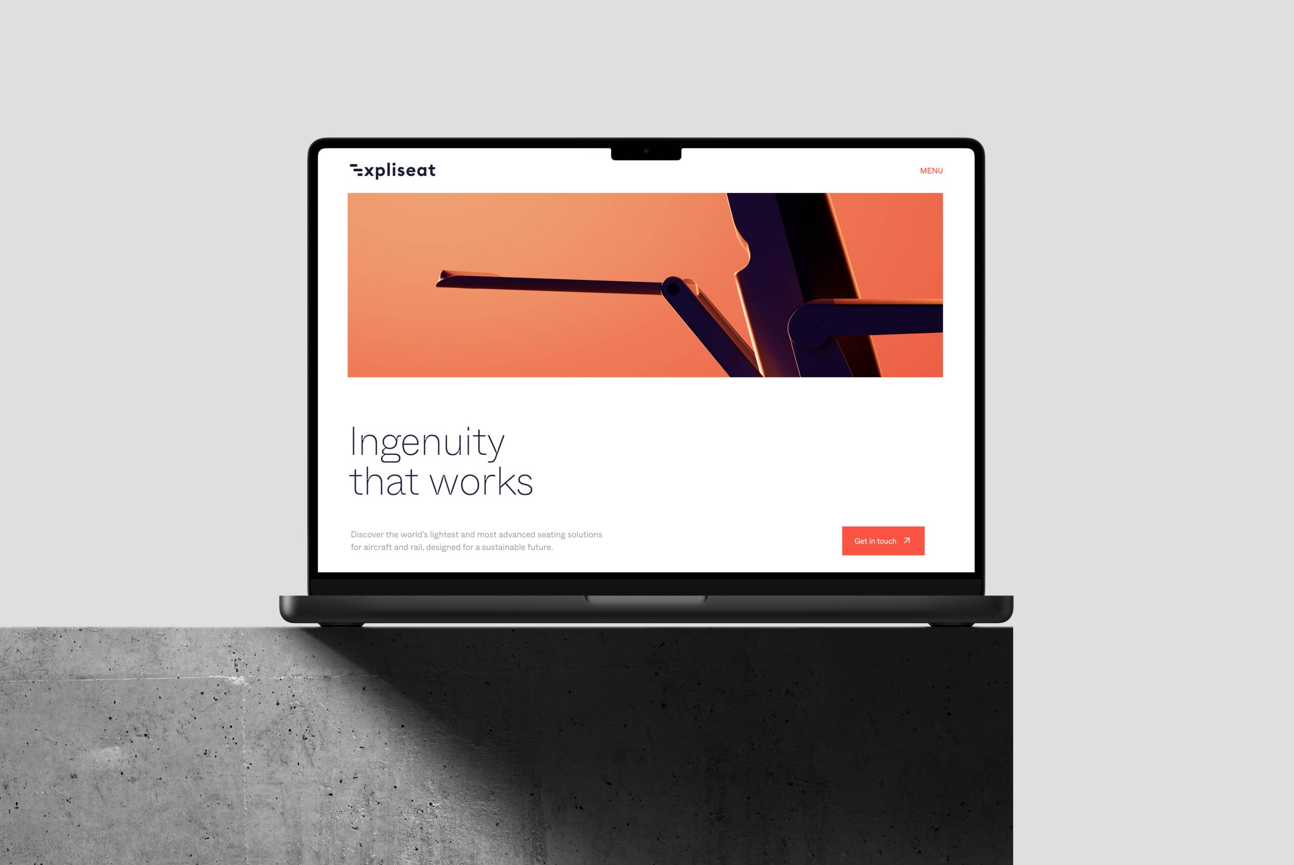
Ingenuity that works
- Brand Identity
- Digital Experience
- Motion Design
- 3D Imagery
- Branded space
- Engaging content
Expliseat represents a new standard in mobility. The French company develops the world’s lightest and most technologically advanced seating solutions – with a clear ambition: to make travel smarter, more efficient, and more sustainable. This is made possible by the use of highly specialized materials such as carbon fiber and titanium, combined with finely tuned manufacturing technologies.
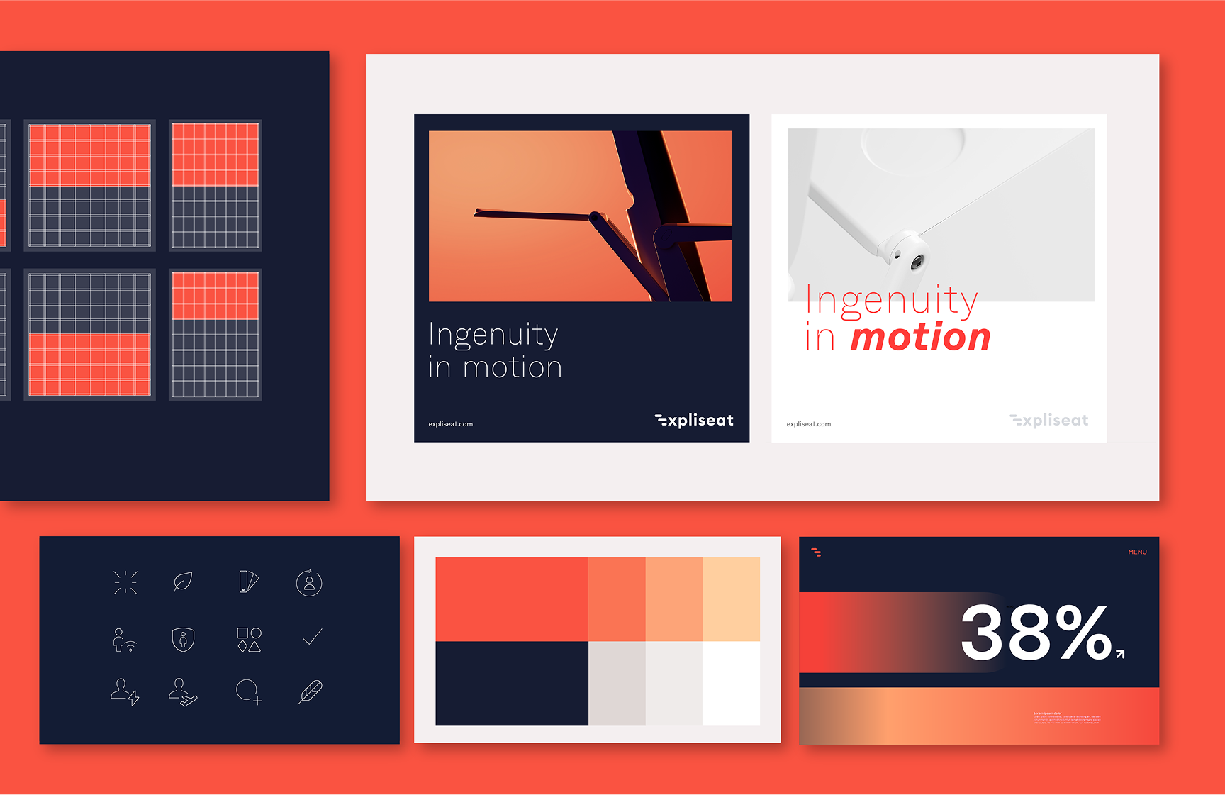
In collaboration with Dichter & Denker, a new brand universe was created that reflects Expliseat’s transformation – from a technical specialist to a globally positioned mobility brand. distylerie translated this repositioning into a brand design that is precise, visually distinctive, and consistently focused on innovation and differentiation.
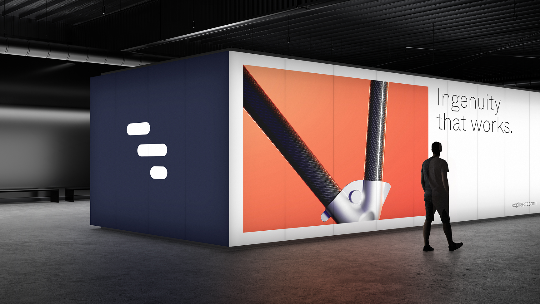
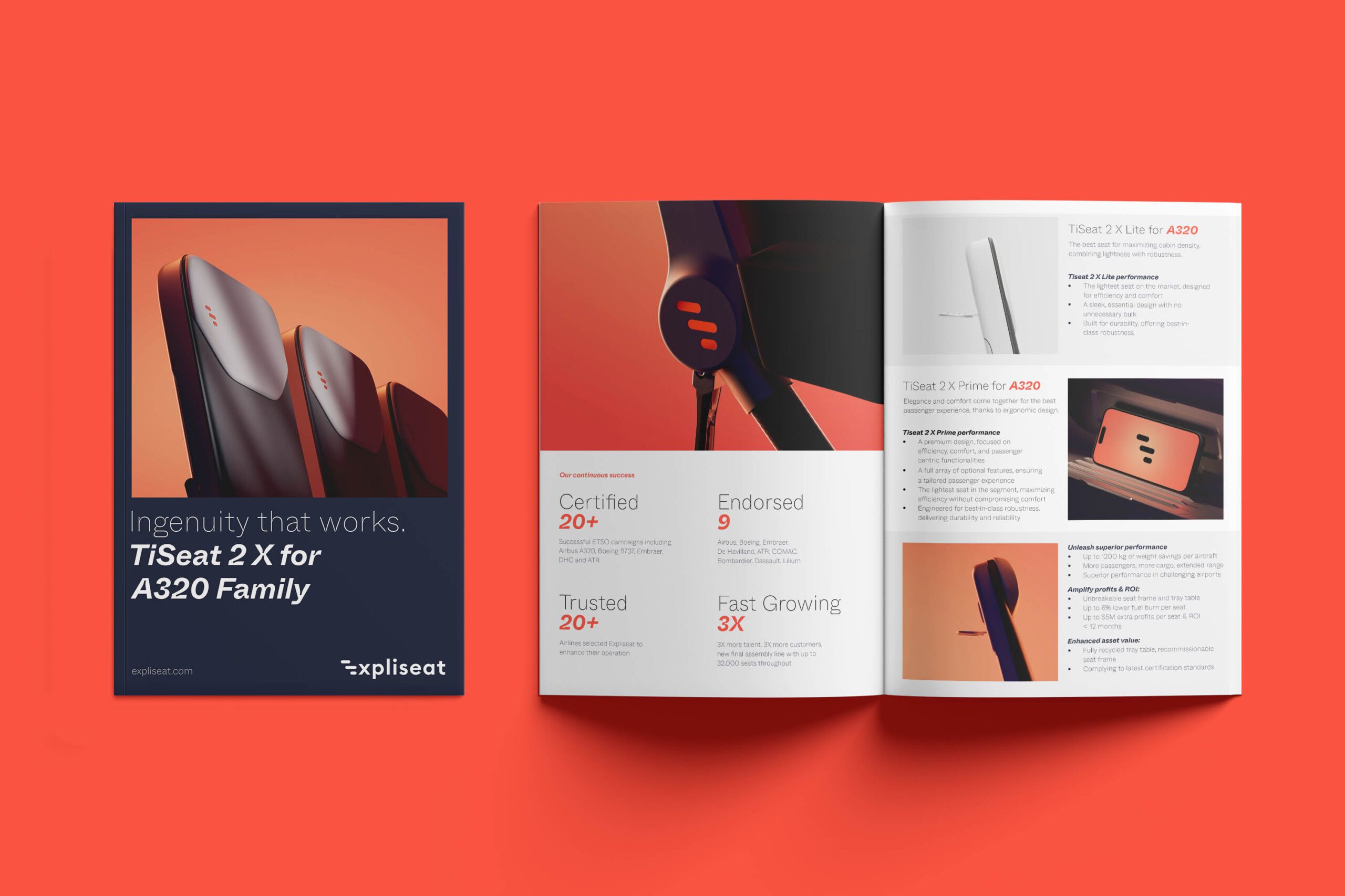
“Ingenuity in motion” – this guiding principle became the foundation of the creative approach: distylerie developed key renderings of the seating solutions and oversaw their implementation across trade fairs and digital applications – from 3D modeling of the seats to real and digital brand experiences, including booth designs, animations, and digital communication assets.
At the heart of the new visual identity lies the Expliseat icon – a powerful symbol of agility, flexibility, and technical precision. Inspired by the letter “E” and rooted in Expliseat’s focus on motion, it blends design cues from both rail and aerospace sectors. Its silhouette evokes the flowing contour of an aircraft seat – bridging brand initial, function, and aesthetics. A symbol that instantly conveys the brand’s essence: Ingenuity that works.
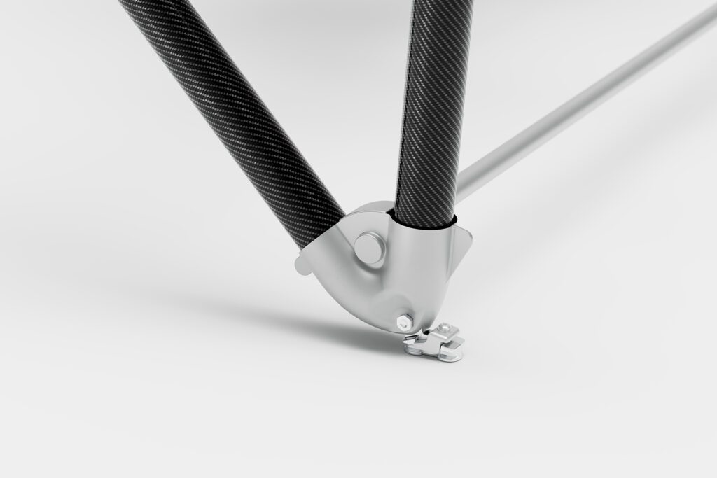
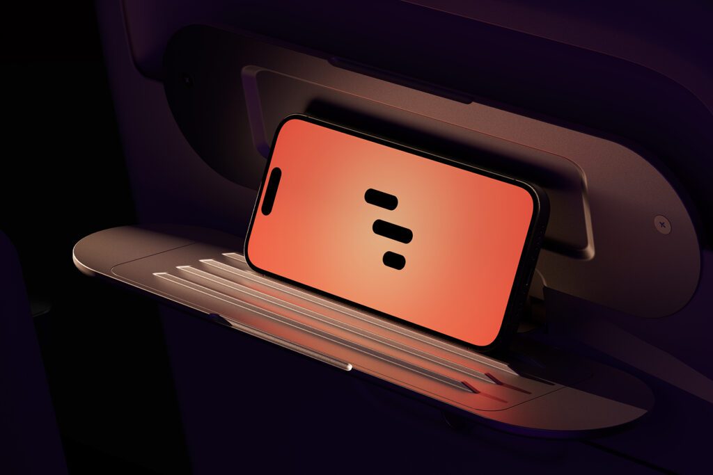
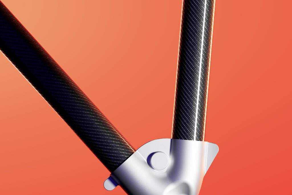
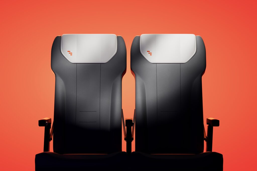
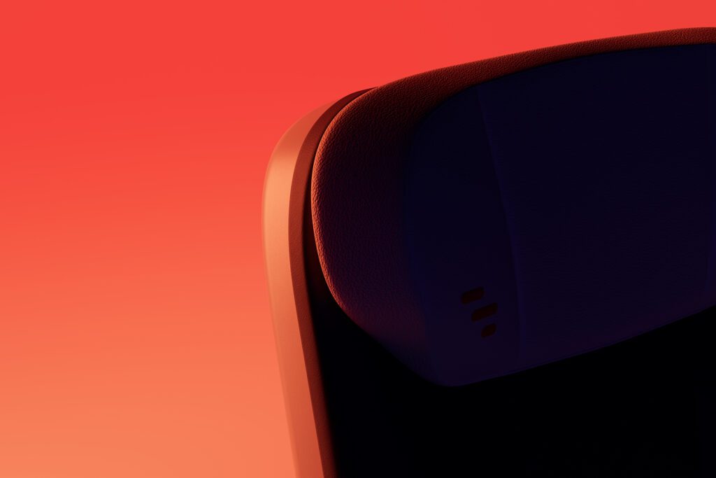
A key component of the redesign is the entirely 3D-based visual language – bold, clear, and focused. Defined by a signature red-orange backlight, it highlights form, materiality, and elegance. The seat is not merely presented as a functional object, but elevated and staged as a statement piece – given a platform where its design and lightness take center stage.
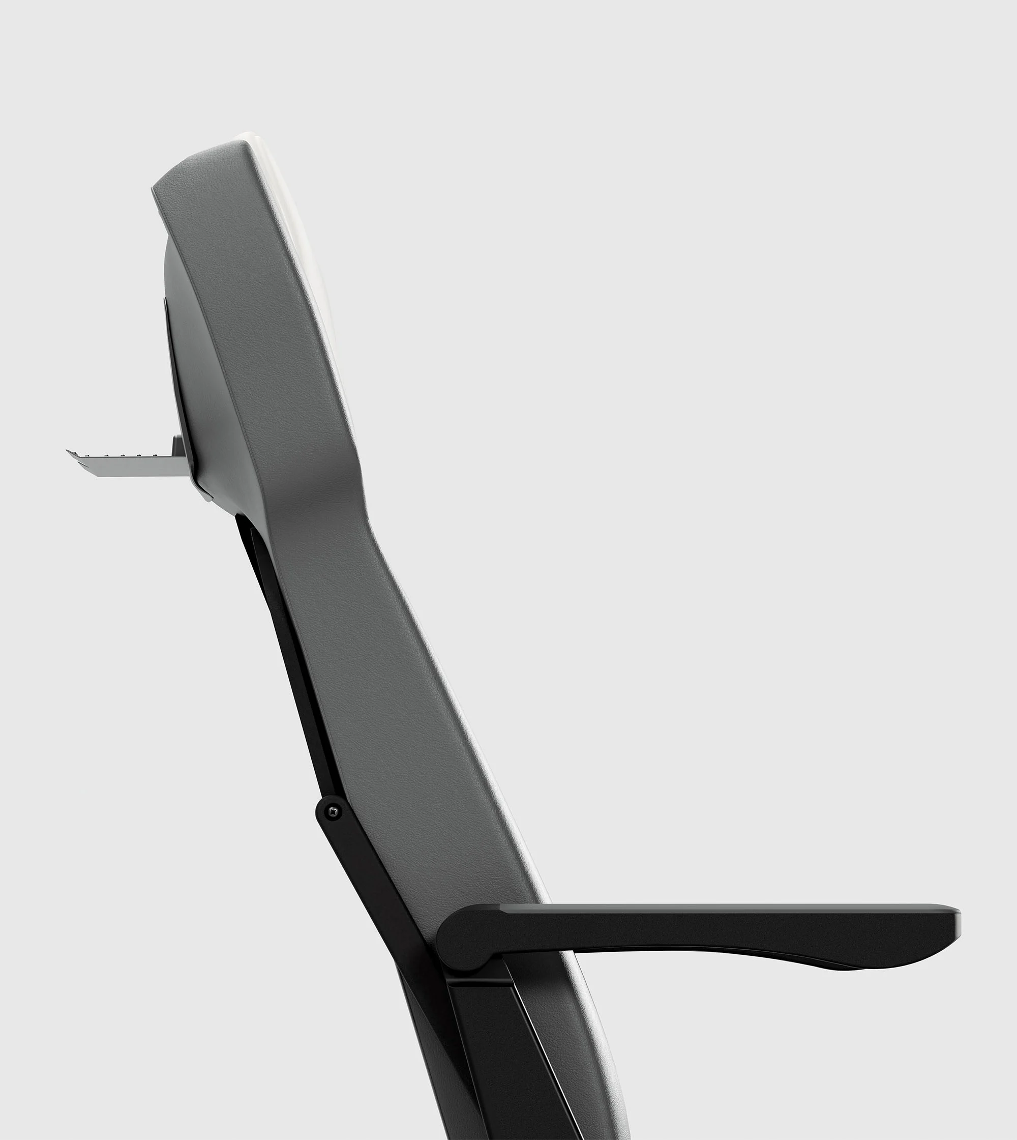
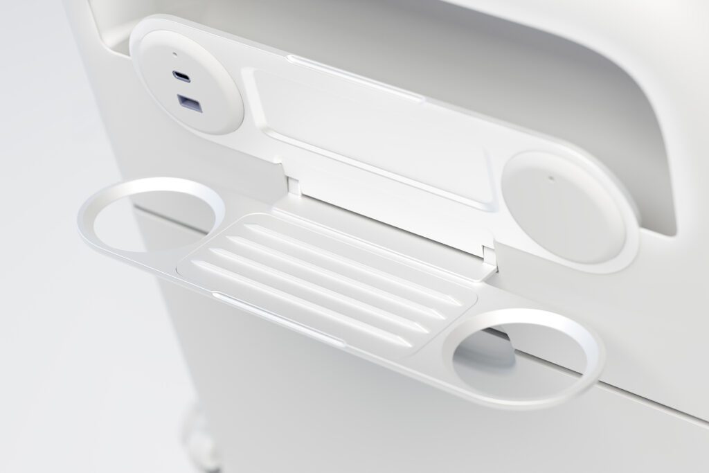
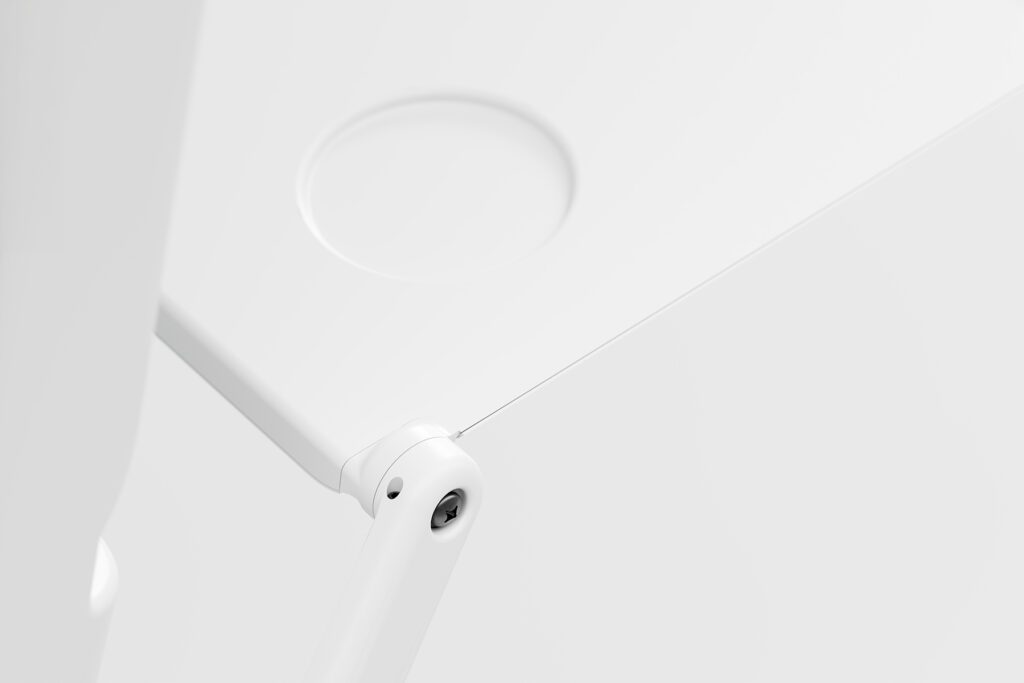
Complementing this is a light, visually restrained version of the imagery – cleanly staged, with an emphasis on technical detail. A deliberate contrast that underlines the brand’s versatility and adaptability.
Want to see more
Alza LXIR
Ammolite
FAQ
Who developed the branding for Expliseat?
The brand design for Expliseat was developed by distylerie, a branding agency in Zurich. The strategic repositioning was created in collaboration with the strategy agency Dichter & Denker; distylerie translated it into a precise, visually distinctive brand design. Expliseat is a French company that develops the world’s lightest and most technologically advanced seating solutions – using materials such as carbon fiber and titanium.
What is a rebranding or repositioning?
A repositioning changes what a brand stands for in the market – and how it is perceived. It is often the trigger for a rebranding, where the visual identity is newly developed. For Expliseat, the work accompanied the transformation from a technical specialist into a globally positioned mobility brand; distylerie translated this repositioning into a clear, future-focused brand design consistently built for differentiation.
What services did distylerie deliver for Expliseat?
We delivered brand identity, digital experience, motion design, 3D imagery, branded space and engaging content. Under the guiding principle “Ingenuity in motion,” we developed the key renderings of the seating solutions and oversaw their implementation across trade fairs and digital applications – from 3D modeling of the seats to booth designs, animations and communication assets. The strategic repositioning itself was created together with the strategy agency Dichter & Denker.
What is 3D imagery and why is it central to Expliseat?
3D imagery is an entirely digitally conceived visual world that stages products photorealistically and with full control – independent of physical prototypes. For Expliseat, distylerie developed a visual language built from the ground up in 3D, defined by a signature red-orange backlight. The seat is not merely shown as a functional object, but staged like an exhibition piece that puts design and lightness centre stage.
What is a brand icon and what role does it play for Expliseat?
A brand icon is a distinctive symbol that conveys the brand idea at a glance. The Expliseat icon is derived from the letter “E” and blends design cues from both rail and aerospace sectors; its silhouette evokes the contour of an aircraft seat. In this way it bridges brand initial, function and aesthetics – carrying the brand idea “Ingenuity that works.”
What is branded space?
Branded space translates a brand identity into the physical environment – for example trade fair booths, exhibitions or event areas. This way a brand is not only seen but experienced. For Expliseat, distylerie supported the staging across trade fairs and in both real and digital applications, so the brand works consistently from screen to show floor.
Can a branding agency also stage technical products?
Yes – technical products in particular benefit from brand leadership that translates function into desirability. For Expliseat, distylerie staged highly specialised carbon fiber and titanium seating solutions so that their lightness, materiality and precision become visible. A complementary, restrained version of the imagery emphasises technical detail and underlines the brand’s versatility.