Benedict is one of Switzerland’s leading educational institutions. The Benedict brand – especially the red wordmark logo – is a staple to most Swiss people. The institution is also known for its practical teaching, its openness to new target groups and its consistent focus on the job market. In short, Benedict has its finger on the pulse.
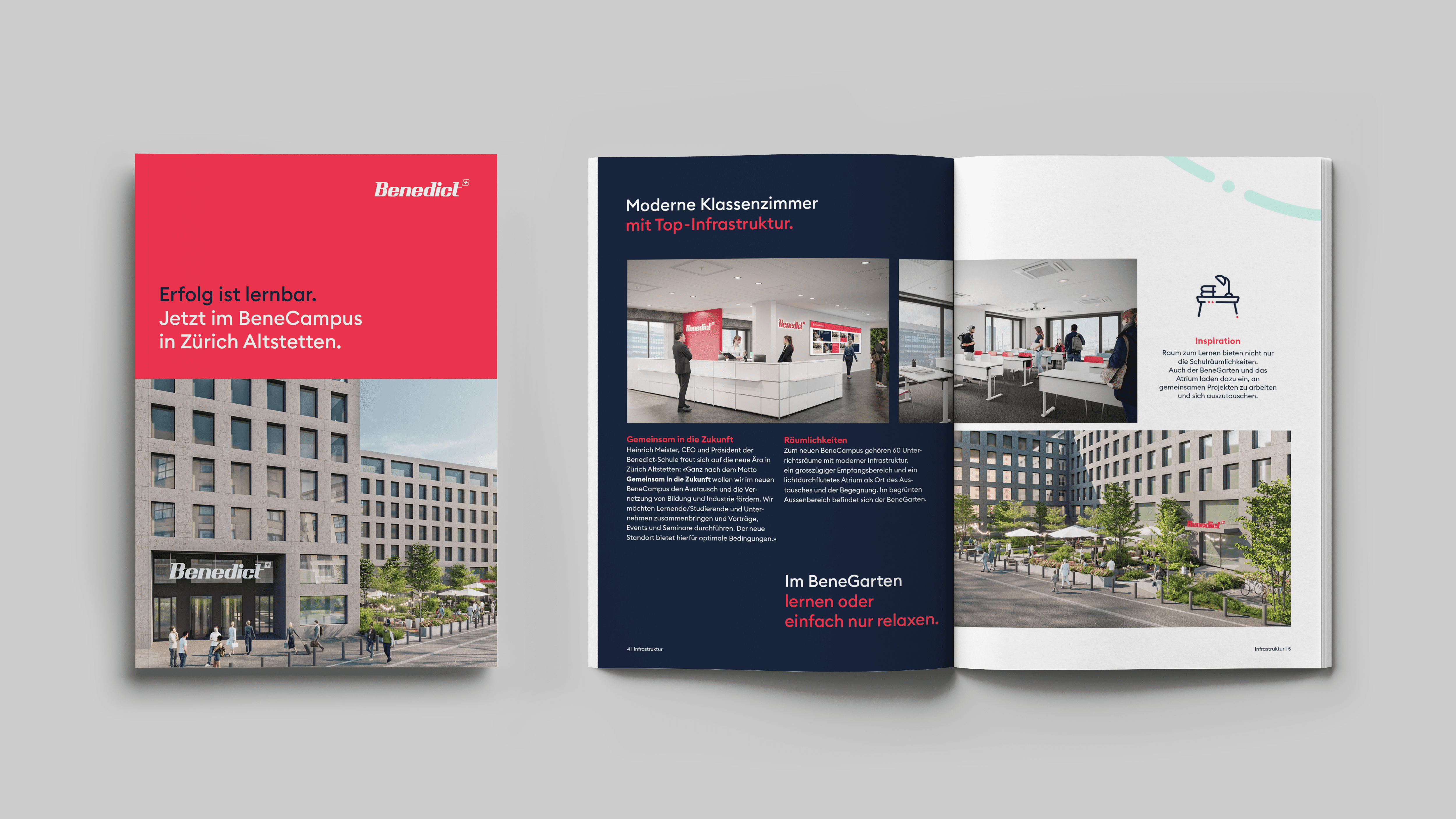
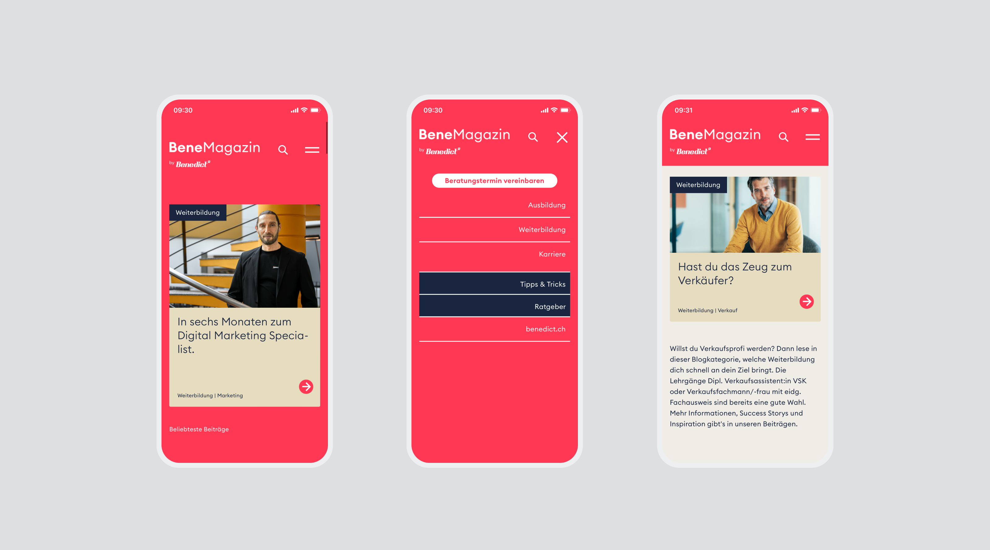
To make this attitude visible and tangible for future generations, distylerie supported the school in a comprehensive brand refresh: from strategic positioning and the further development of the most important brand elements to digital implementation for three school locations, in particular for the new BeneCampus in Zurich Altstetten.
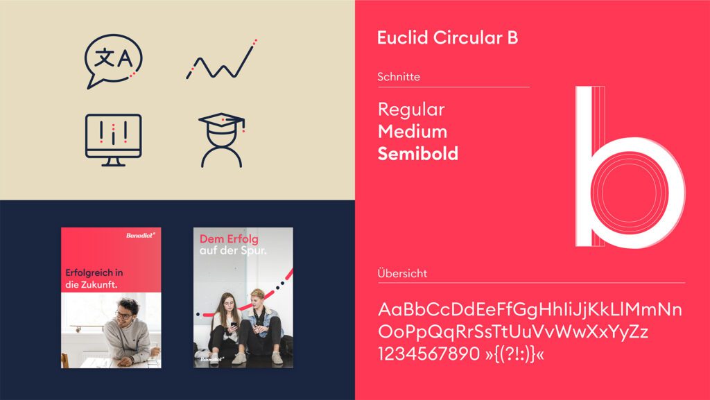
The focus was on sharpening the Benedict brand as an educational provider that does not want to be exclusive, but rather accessible, optimistic and professional. To this end, distylerie developed a new, visually distinctive brand design: with a clear logo, warm colour schemes, the geometric font Euclid Circular B and imagery that focuses on people and real life.
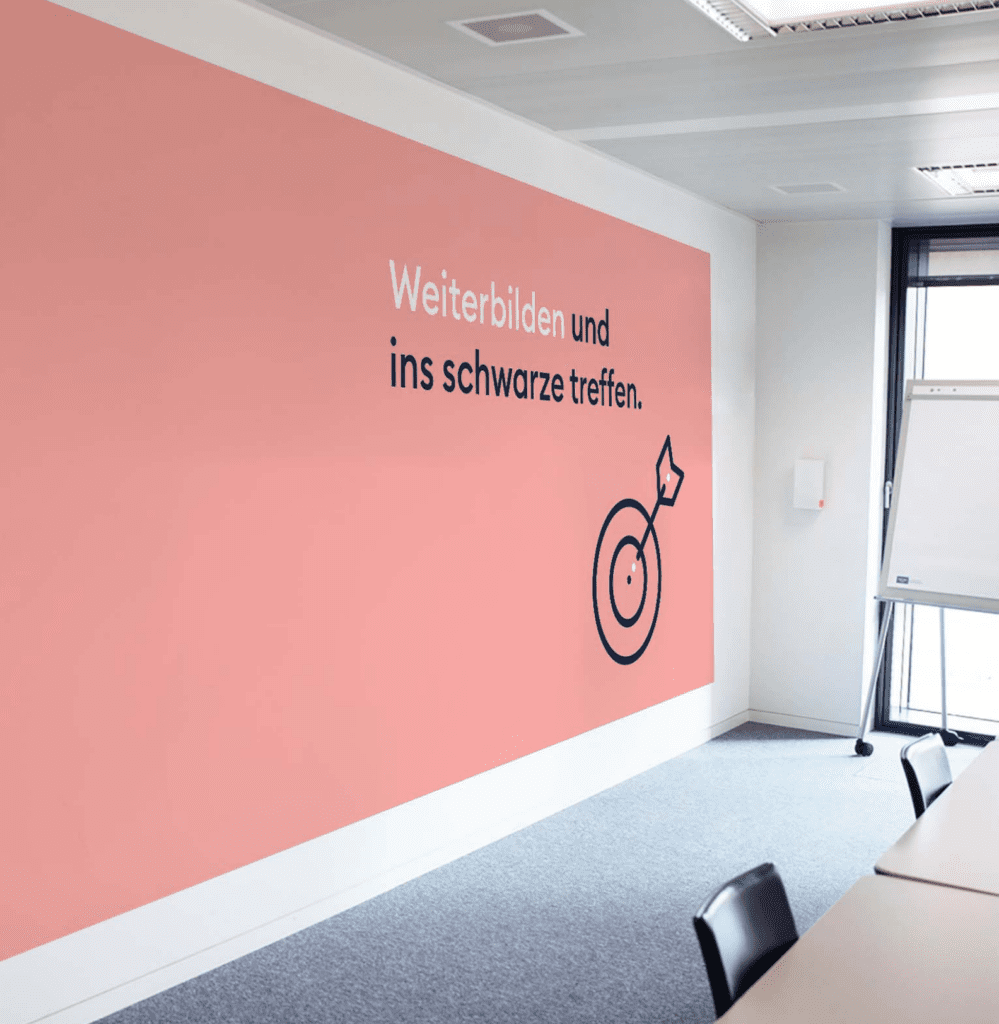
‘Step by step to success’ – this Benedict motto is also reflected in the design: the so-called line to success runs through the entire visual identity as a graphic element. It visualises individual learning paths and signals that progress is not standardised – but personal and flexible.
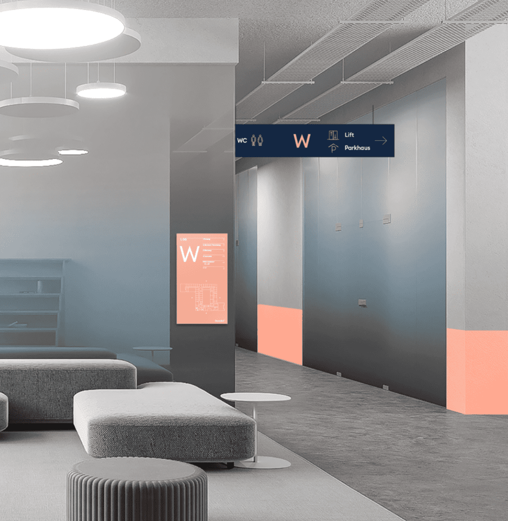
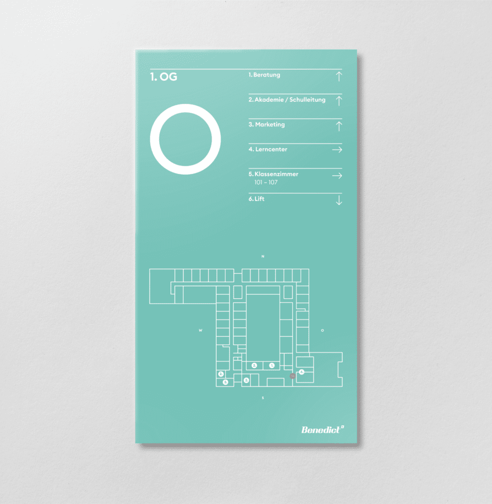
Beyond the digital brand presence, distylerie also developed signage systems, brochures, and editorial materials. The outcome is a brand that inspires, guides, and empowers people to take the next step in their journey.
The rebranding of the education brand Benedict was created by distylerie, an award-winning branding agency from Zurich. Benedict is one of Switzerland’s leading educational institutions, and its red wordmark is familiar to most Swiss people. distylerie supported the school through a comprehensive brand refresh – from strategic positioning and the key brand elements to digital implementation. The outcome is a further-developed version of an iconic brand.
What services did distylerie deliver for Benedict?
distylerie was responsible for positioning, brand strategy, visual identity, system design, UX/UI design, motion design, consulting as well as film and graphic motion. Concretely, this produced a sharpened brand design, the digital implementation for three school locations – in particular the new BeneCampus in Zurich Altstetten – plus signage, communication materials and brochures. The “line to success” runs through the entire identity as a graphic element.
What is a rebrand or brand refresh?
A rebrand develops an existing brand further without losing its recognition value. For Benedict it was not about a break but a sharpening: the iconic brand was positioned to be more accessible, optimistic and professional. distylerie kept the familiar core elements and evolved them for future generations. That is how a brand stays relevant without losing its history.
What does a brand strategy for an educational institution include?
A brand strategy defines a brand’s positioning, attitude and audiences. For Benedict, the focus was on sharpening it as an education provider that does not want to be exclusive but accessible, optimistic and professional. From this strategy, distylerie derived the brand design and the digital implementation. At distylerie, brand strategy is always the starting point from which design and communication follow.
What is a visual identity and what does it consist of?
A visual identity unites logo, colours, typography, imagery and graphic elements into a consistent system. For Benedict, distylerie developed a new, visually distinctive brand design with a clear logo, warm colour schemes and the geometric typeface Euclid Circular B. The imagery puts people and real life in the foreground. As a connecting element, the “line to success” visualises individual learning paths.
What do system design and signage contribute to a brand project?
System design ensures that all brand elements work together with a clear logic – across digital and physical channels. Signage carries this system into space, for example in wayfinding at school locations. For Benedict, distylerie designed signage systems, brochures and editorial materials alongside the digital presence. This creates a consistent brand experience from screen to building.
What makes a strong brand identity in education?
A strong brand identity in education combines credibility with accessibility and orientation. For Benedict, the motto “Step by step to success” is reflected directly in the design – the “line to success” makes individual, flexible learning paths visible. The result is a brand that inspires and invites people to take the next step in their journey. distylerie translates attitude into an identity that guides and empowers.