



Robotics Institute Germany
- Brand Strategy
- Brand Identity
- Digital Experience
- UX/UI Design
- Motion Design
- Branded space
RIG is the new driving force behind robotics-powered innovation in Germany. Created to connect science, industry, and society, RIG promotes sustainable progress through AI-driven robotics – positioning Germany as a leading global hub for technological excellence.
Supported by the Federal Ministry of Education and Research (BMBF), RIG brings together the country’s leading robotics hubs. Its mission: to raise international visibility, attract top talent, and accelerate breakthroughs in intelligent robotics. The initiative is backed by 16 renowned universities – including TUM, KIT, RWTH Aachen, and the University of Stuttgart – and focuses on five key innovation fields.
In close collaboration with the RIG team, distylerie developed a clear, future-focused brand identity. It translates scientific excellence into a distinctive visual language and gives RIG a unique profile within the global innovation landscape.
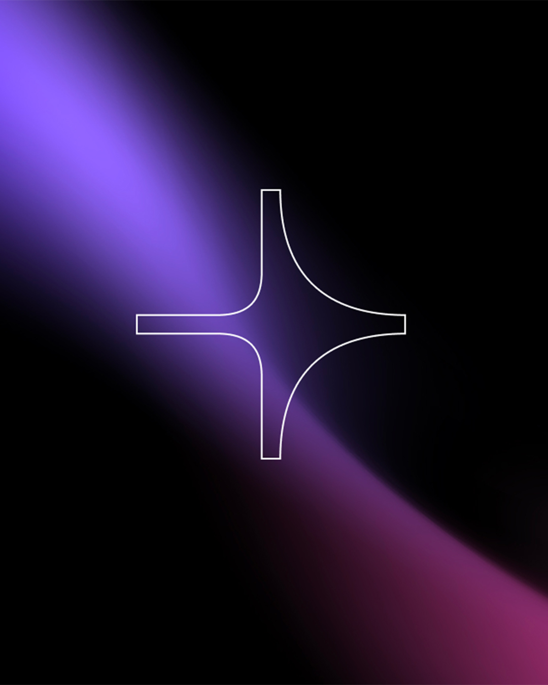
At the core of the design system lies the “+” symbol – representing the convergence of science, industry, and society. Its form reflects the dynamic shape of an arrow, symbolizing direction, progress, and momentum.
The symbol anchors the entire visual system, transforming the idea of synergy and technological vision into a confident and recognisable design language.
As a secondary design element, a dynamic gradient was developed to visualise the fusion of disciplines, the interplay between humans and machines, and the energy driving intelligent systems. These gradients express innovation and interaction – bringing depth, movement, and tension to the RIG visual identity.
Primarily applied on dark backgrounds to enhance focus and contrast, they can also be used on light surfaces to create clarity and calm.
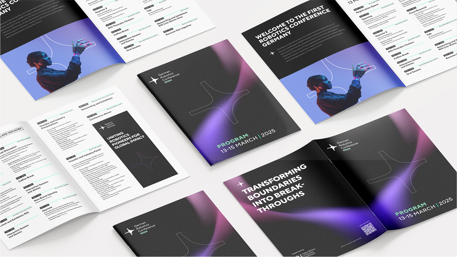
distylerie created the brand identity in close partnership with the RIG team – from strategic foundations to implementation across digital media, event appearances, and print materials.
Want to see more
Ammolite
TrueTurn
FAQ
Who developed the branding for the Robotics Institute Germany (RIG)?
The brand identity for the Robotics Institute Germany (RIG) was developed by distylerie, a branding agency in Zurich. Working closely with the RIG team, we developed a clear, future-focused brand identity. RIG is the new driving force behind robotics-powered innovation in Germany, supported by the Federal Ministry of Education and Research (BMBF) and backed by 16 renowned universities such as TUM, KIT, RWTH Aachen and the University of Stuttgart.
What is corporate design or a brand identity?
A brand identity is the visual and strategic system that lets an organisation appear consistently and unmistakably – from logo and colours to typography, motion and digital applications. It translates content and attitude into a recognisable language. For RIG, distylerie developed an identity that translates scientific excellence into a distinctive visual language.
What services did distylerie deliver for RIG?
We delivered brand strategy, brand identity, digital experience, UX/UI design, motion design and branded space. distylerie developed the identity from its strategic foundations through to implementation across digital media, event appearances and print materials. At its core is a custom-built design system centred on the “+” symbol and a dynamic gradient.
What does the “+” symbol mean in the RIG design system?
The “+” symbol sits at the core of the RIG design system and represents the convergence of science, industry and society. Its form reflects the dynamic shape of an arrow – a sign of direction, progress and momentum. It anchors the entire visual system and translates the idea of synergy and technological vision into a confident, recognisable design language.
What is a brand system (design system)?
A brand system is a coherent set of building blocks – logo, symbol, colour, typography, motion, layout – that keeps a brand consistent yet flexible across all applications. For RIG, distylerie developed a system around the “+” symbol and a secondary, dynamic gradient that visualises the interplay between humans and machines and the energy driving intelligent systems.
How do you design a brand for AI and robotics?
A strong brand in AI and robotics translates complex technology into a clear, trustworthy and future-focused language. For RIG, distylerie developed a visual identity that makes scientific excellence tangible and gives the initiative a distinctive profile within the global innovation landscape. Motion design and dynamic gradients give the brand depth, tension and movement.
What role does motion design play for RIG?
Motion design brings a static identity to life and conveys energy, movement and progress – core values of an innovation brand. For RIG, distylerie developed animated applications around the logo, typography, icons and gradients that make the fusion of disciplines visible. The result is a dynamic brand presence for digital media and event appearances.